
Author
Bruce Orr
November 4, 2020
Read Time: Less than 4 Mins
First Published: November 4, 2020
Guest Contributor: Bruce Orr, ProNovos
Contractors leveraging data analytics solutions experience an average 18% reduction in project delays and a 23% improvement in budget adherence. FOUNDATION® Construction Software makes it easy for contractors to use their data in creative ways, whether they’re running reports in DataGenie or Executive Dashboard or producing advanced visualizations in a tool like ProNovos Construction Data Analytics.
But it’s important to keep in mind precisely who will use those reports.

Your intended audiences for published reports and dashboards based on FOUNDATION data could include:
- a surety company that insists on seeing specific information about your projects;
- a busy superintendent crisscrossing a large area to see what’s happening at multiple job sites;
- a c-suite executive who loves to dive into “the weeds” at your company by meditating on the patterns to be discovered in rows and columns of numbers; or
- a shareholder in the business who wants high-level histograms, charts and graphs.
Clearly, a one-size-fits-all approach won’t work here. It’s useless to produce a report if the intended user ignores it. This is why one FOUNDATION user was so focused on communicating better with field personnel.
“When it comes to the field managers, you’ve got to break it down into their language,” he said. “They’re accustomed to crew hours and days, not dollars and cents and complex projections.”
Exactly. But tailoring reports to different audiences can become time-consuming and laborious if it involves manually creating and recreating too many complex spreadsheets.
The data-warehousing capabilities of today’s analytical platforms solve that problem. These tools provide a way to pull in data from multiple applications and then “drag and drop” different fields to produce a wide array of automated reports.
Consider the following examples:
In submitting bids, a transportation contractor provides high-level, consolidated owner’s line items in categories like “Excavation” or “Clearing, Grubbing & Stripping.” These cost estimates represent the totality of smaller line-item costs associated with the job. On an excavation project, that could be the sum of the costs to be incurred in loading and hauling soil over four different distances: 4,000, 3,000, 2,000 and 1,000 feet.
After that project is running, decision-makers at the contracting firm now become the new audience for that data. Their goal is to stay in touch with how that project is performing versus the bid amount.
But once FOUNDATION has already broken these costs down into phase-codes, how can the contractor see both the owner’s line item and how each sub line item is performing?
An analytics platform makes it simple. At the beginning of the job, the contractor maps specific sub-codes to particular owner’s line items. As a result, the office and its field personnel can now monitor performance at the micro and macro levels as needed.
Contractors using FOUNDATION may also benefit by mapping their phase and cost codes to the AIA schedule of value line items, because doing so allows them to get a clear picture of their true over/underbillings per-line-item. Underbillings are important, of course, because they may indicate that you need to negotiate your schedule of values more aggressively, or that you aren’t going to make as much profit as you thought.
Overbillings, meanwhile, could indicate that you’re negotiating aggressively and/or that the job will be more profitable than anticipated. “In either case, you really want to understand what’s driving it,” said one FOUNDATION user. “Don’t leave it to guesswork.”
Modern analytical platforms are also increasingly powerful with respect to data visualization, which allows FOUNDATION users to create charts, graphs and histograms that communicate a lot of information at a glance.
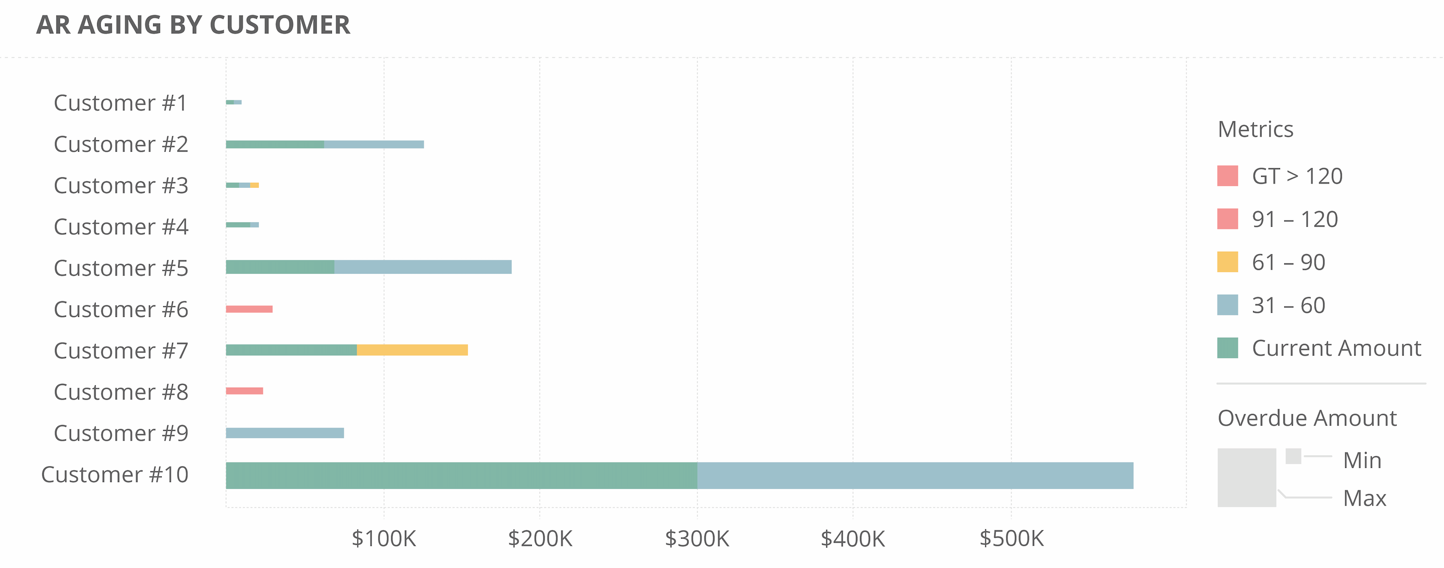
Let’s say the accounting department has a lengthy AR Aging Report that it wants to boil down into a quick visual for PMs responsible for making collection calls.

Using analytics, the accounting team could convert rows and columns of AR data into dashboards that tell the story visually. In an AR-aging graph [PICTURED], the length and thickness of the horizontal lines would help PMs see which customers owe the most money. Color codes would indicate the aging of those outstanding dollars—from the harmless 30-day demarcation, to the more-concerning 90 days and counting.
Combining FOUNDATION data with modern analytics can open up new possibilities. You should love your data, not struggle with it. By taking a more conscious approach, you’ll be amazed at the insights you can gain and the problems you can solve.
Share Article
Make Your Inbox Smarter
Keep on current news in the construction industry. Subscribe to free eNews!
Related Articles

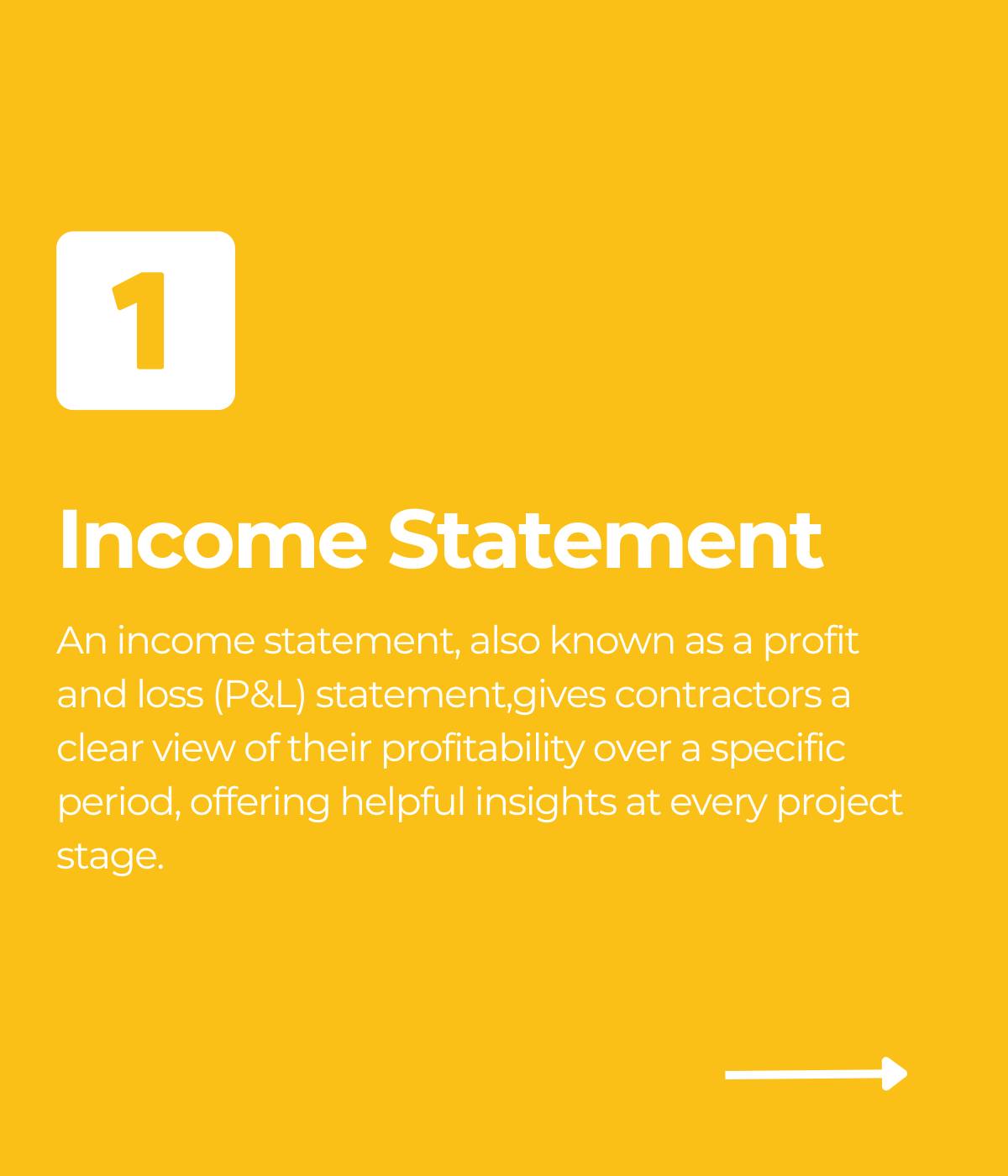
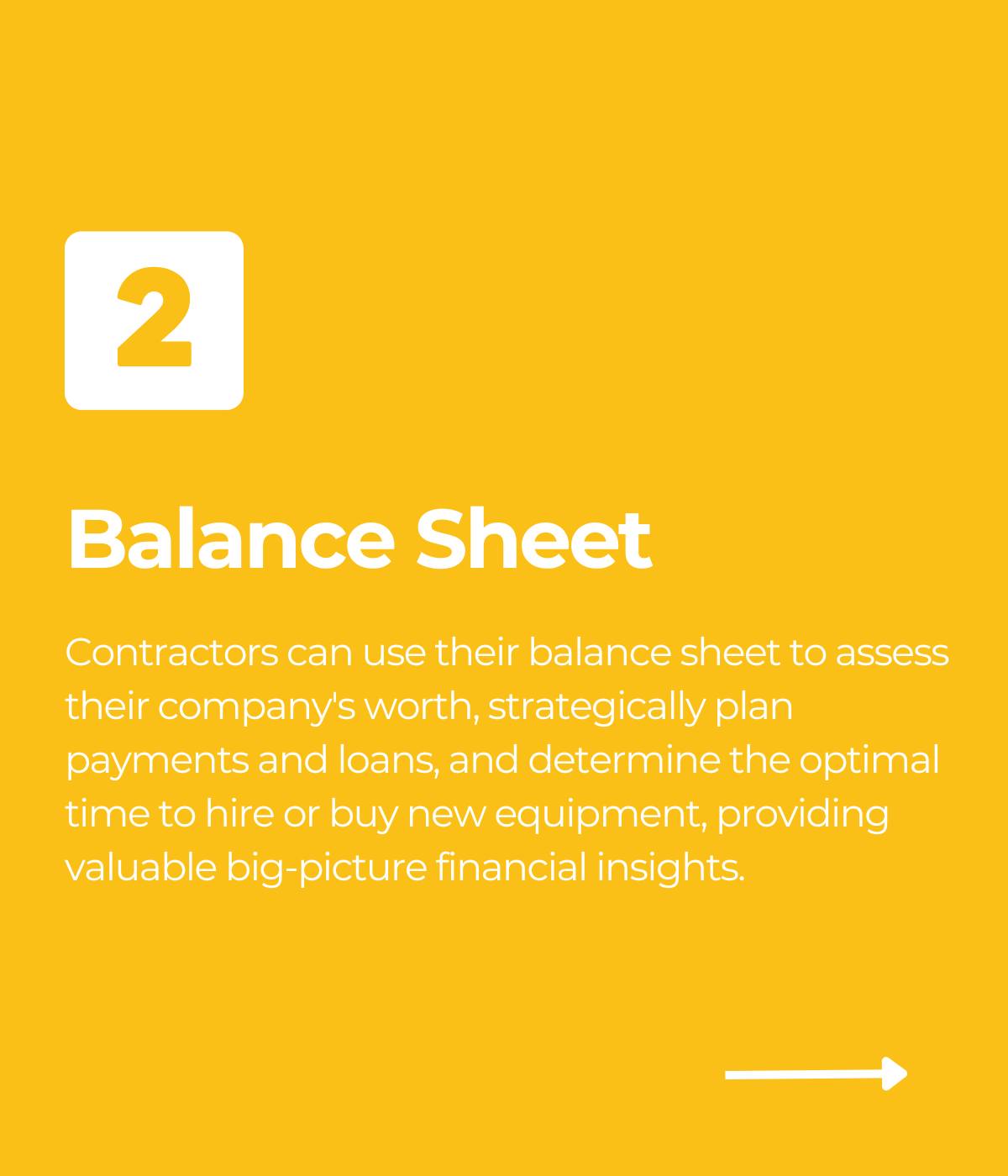
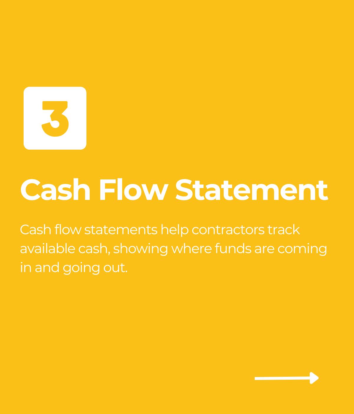
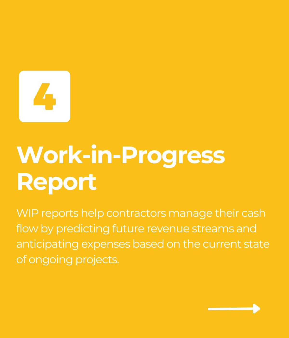
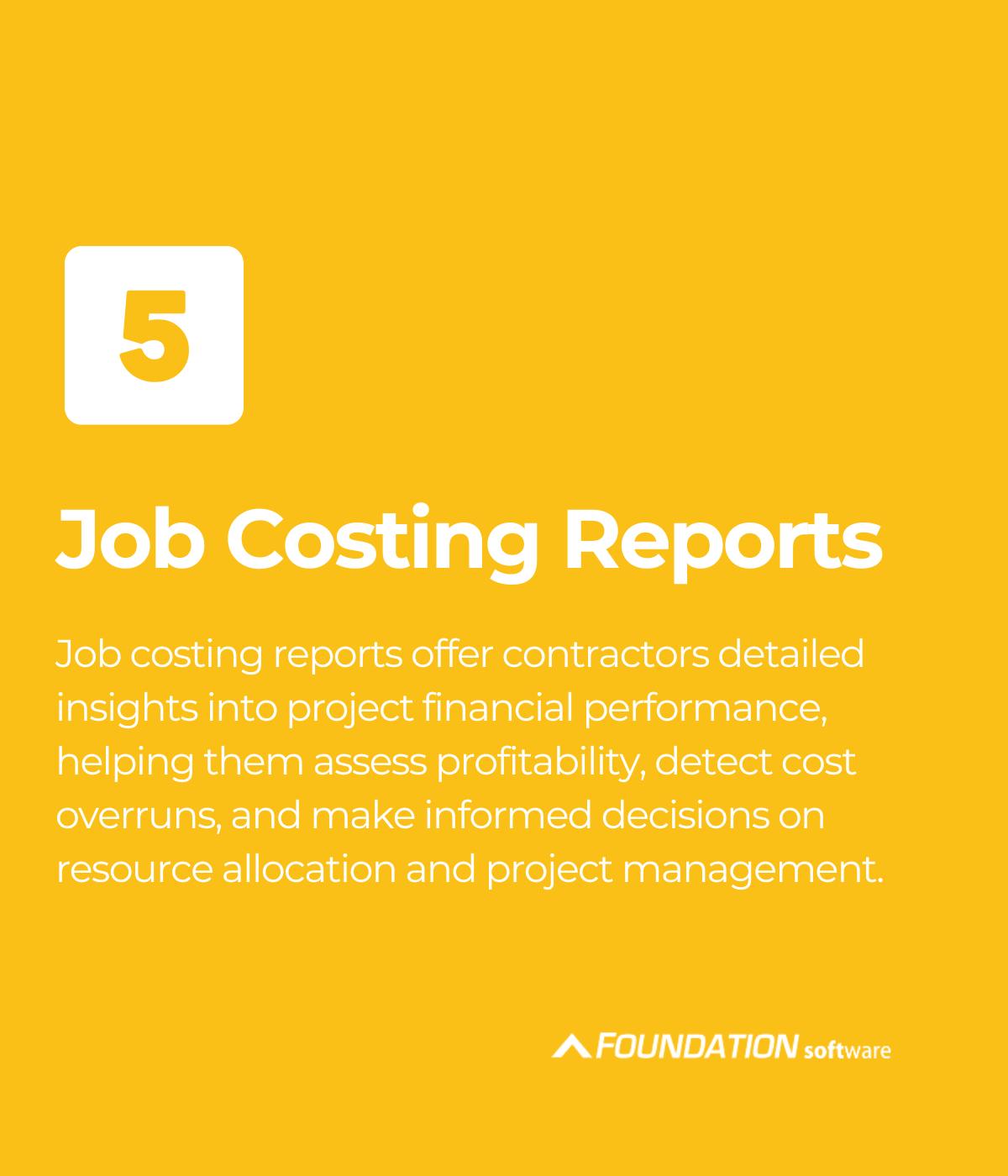
Top 5 Construction Reports and How They Help Your Business
Construction reports are the financial backbone of a contractor’s business. Contractors leverage these reports to make decisions that are critical
Learn More

How to Select Construction Accounting Software for Your Company
Before selecting a construction accounting solution for your company, it’s important to research your choices and evaluate your company’s needs.
Learn More
Our Top 3 YouTube Videos
Learn about our software more in depth with product overviews, demos, and much more!
ACA & W-2 Services
Our ACA reporting & e-filing services include official 1094-C and 1095-C IRS reporting, optional e-filing (no applying for a TCC code required), mailing to your employees and experienced support to help you.
Client Testimonials
There are plenty of reasons to make FOUNDATION your choice for job cost accounting and construction management software — just ask our clients!
Product Overviews
From job cost accounting software, to construction-specific payroll. Get an overview on your next all-in-one back-office solution.